

Graphic Design
In a world of constant noise, we chose to speak softly but carry more weight. For SAILOR, the goal wasn't just to create a logo, but to distill the brand’s DNA into its purest form.
Minimalism in fashion isn't about what’s missing, it’s about what remains. By stripping away the unnecessary, we’ve created a visual anchor that is versatile enough for a woven label, yet bold enough for a storefront. This design reflects SAILOR’s commitment to quality over trends and longevity over 'fast' aesthetics."
We gave SAILOR a look that feels current today and classic in 20 years.
SAILOR Merch.
For BodyPat Mart, the challenge was to create an identity that instantly communicates premium retail. By integrating the brand’s initials directly into the silhouette of a shopping cart, we’ve created a literal vehicle for the brand’s mission: bringing quality UK products to the doorsteps of Ghana.
The use of a bold circular badge provides a sense of a seal of quality, while the clean typography ensures the brand remains approachable and modern. It’s not just a logo, it’s a promise of a seamless shopping experience.
BodyPat Mart.
This crest for Mina Royals Basic School moves away from the typical cluttered school badge toward a clean, "Evolutionary" aesthetic. Since it's an educational institution, the language should feel prestigious, inspiring, and grounded in growth.
Educational branding is more than just a badge, it is a symbol of a student's journey. For Mina Royals Basic School, we reimagined the traditional crest through a minimalist lens. By pairing the classic shield with clean, modern lines and a bold purple palette—the color of royalty and wisdom—also the clour of the school-we’ve created an identity that respects the school's 2011 foundations while looking forward to the next evolution.
The open book and laurel wreath remain at the heart of the design, representing the light of knowledge and the victory of academic achievement, simplified for a digital-first world.
Mina Royals Basic School
How do you make a name sing? For Drummerboy KB, we didn't want the logo to just sit next to the text, we wanted it to be part of the beat. By integrating a minimalist drum kit directly into the typography, the brand becomes synonymous with the instrument itself.
The clean, wide-spaced sans-serif font provides a modern, 'tour-ready' feel, while the treble clef detail inside the bass drum adds a touch of musicality and soul. It’s a bold, monochrome look designed to stand out on everything from a kick drum head to digital streaming platforms."
Drummer Boy KB
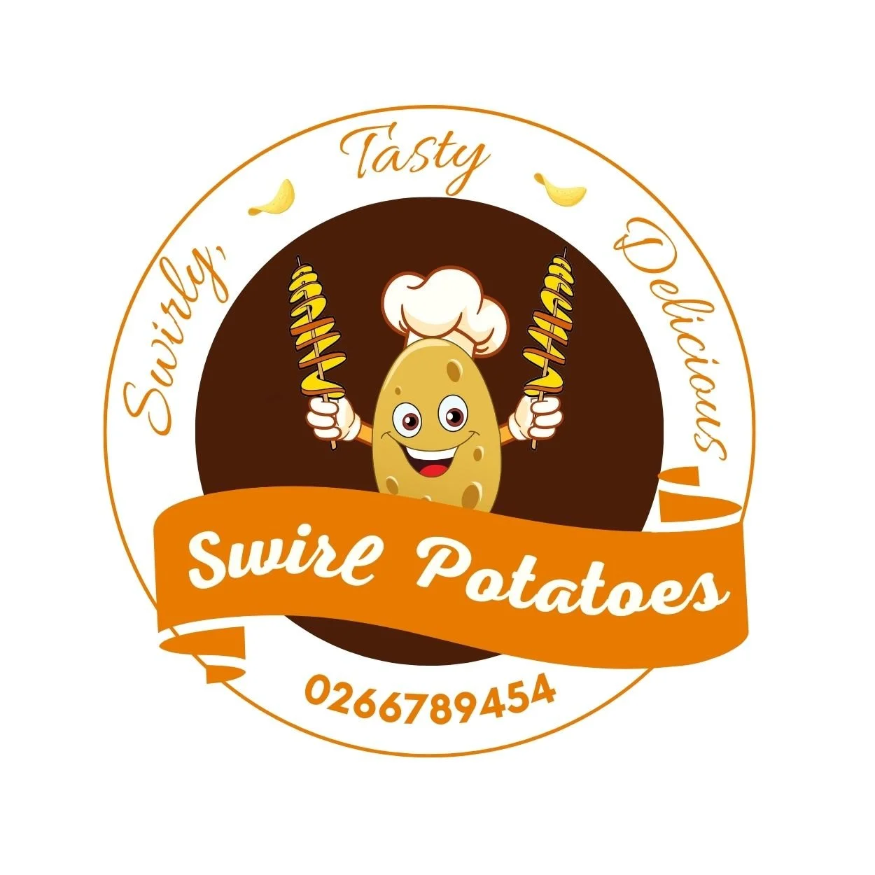
Food is an experience, and branding should be too. For Swirl Potatoes, we didn't just design a logo we created a potato mascot. By giving the brand a fun, potato chef wearing a hat, we’ve made the business instantly approachable and family-friendly.
The warm golden brown palette triggers an immediate appetite response, while the circular badge design makes it perfect for stickers, food packaging, and social media icons. It’s a logo that promises a snack that’s as fun to look at as it is to eat!
Swirl Potatoes
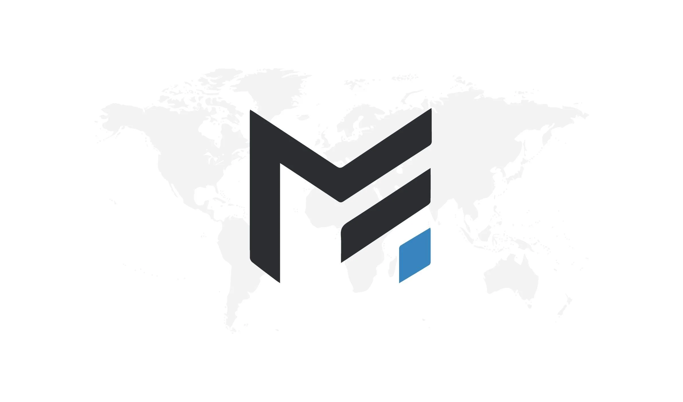
Born from the stage but built for the world. Made Rolls handles the complex logistics and administration that power a musical legacy. The branding reflects this global reach through a minimalist, bold icon that sits with authority against a world-map backdrop.
The design utilizes negative space to bridge the letters 'M' and 'R,' symbolizing the seamless connection between the music and the management. This isn't just a logo, it’s a corporate seal of reliability for artists, partners, and stakeholders worldwide.
Made Rolls
In the multimedia world, attention is the ultimate currency. For The 8 Group, we designed an identity that doesn’t just ask for attention; it commands it. By using ultra-bold, heavy-weight letterforms, we’ve created a visual presence that feels solid and established.
The genius is in the negative space: the '8' is cleverly integrated into the letter ‘I’ creating a seamless link between the brand name and its identity. Paired with a high-energy red background, this logo communicates a company that is loud, proud, and capable of handling large-scale creative projects with precision.
The Eight Group
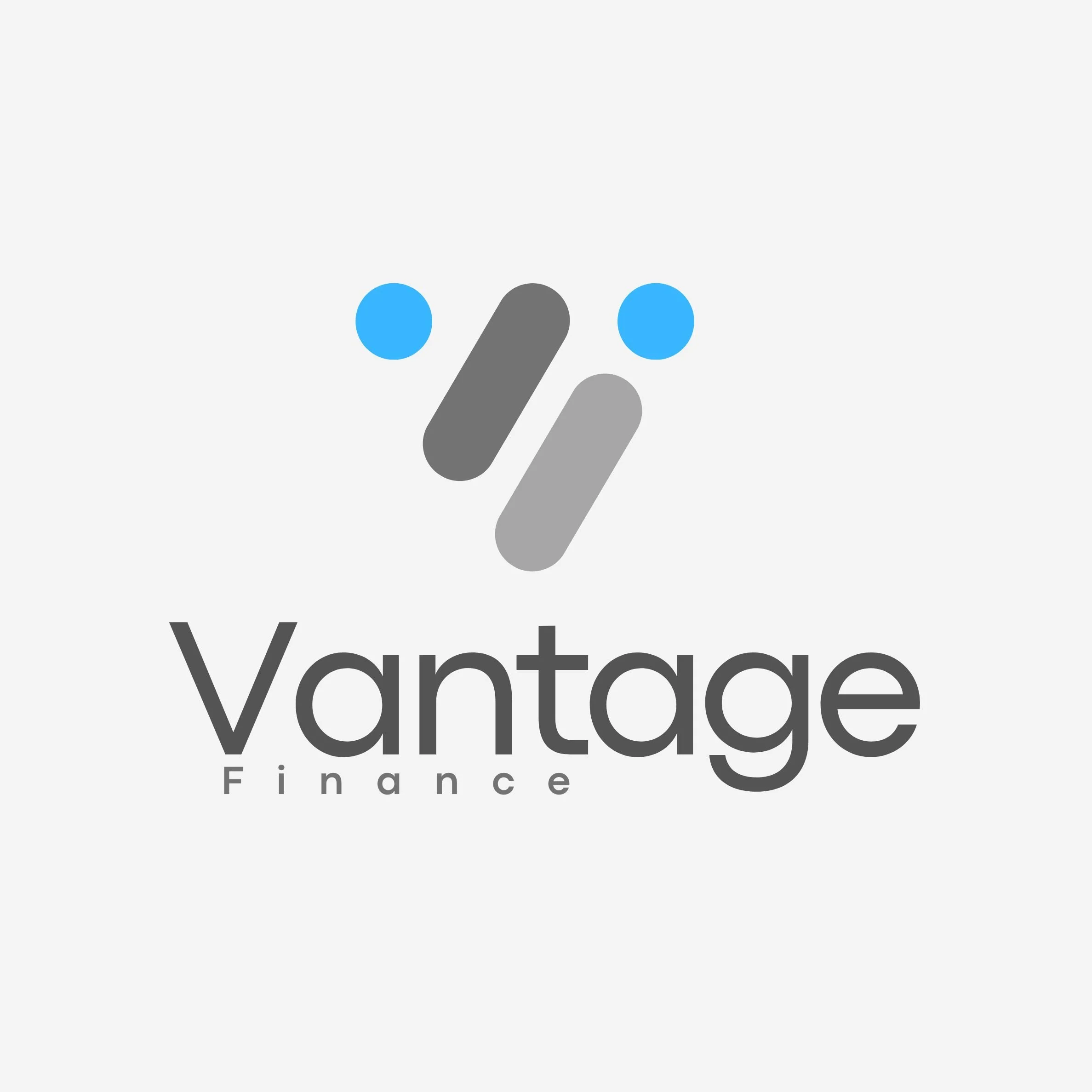
In the fintech and modern finance space, clarity is the ultimate asset. The Vantage Finance logo was built on the pillars of precision and accessibility. We moved away from heavy, traditional emblems to create a light, airy mark that feels digital.
The use of grey tones provides a foundation of corporate stability, while the vibrant blue accents inject energy and innovation. This identity is designed to live effortlessly on mobile apps and professional web platforms, signaling to clients that Vantage is an agile, forward-thinking partner in their financial journey.
Vantage Finance
Logistics is a puzzle where every piece must fit perfectly. For Fleet, we designed an identity that represents the intersection of technology, transport, and timing. The overlapping geometric blocks symbolize the seamless transition of goods from one point to another.
By using a vibrant palette of cyan, royal blue, and a high energy red nexus point, we’ve highlighted the core of the business: the point of connection. This modern, minimalist mark positions Fleet as a logistics partner that is organized, transparent, and digitally integrated.
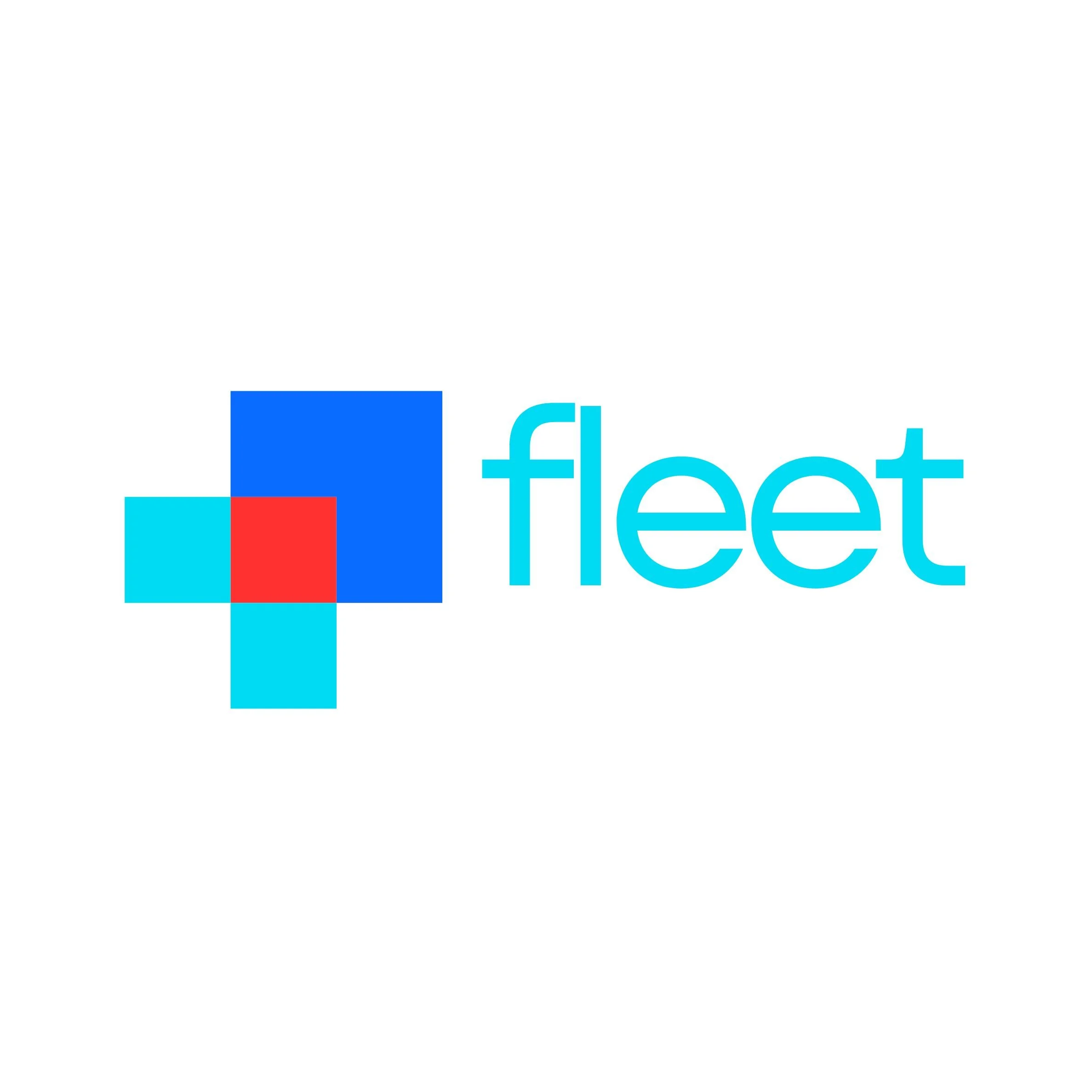
Fleet Logistics
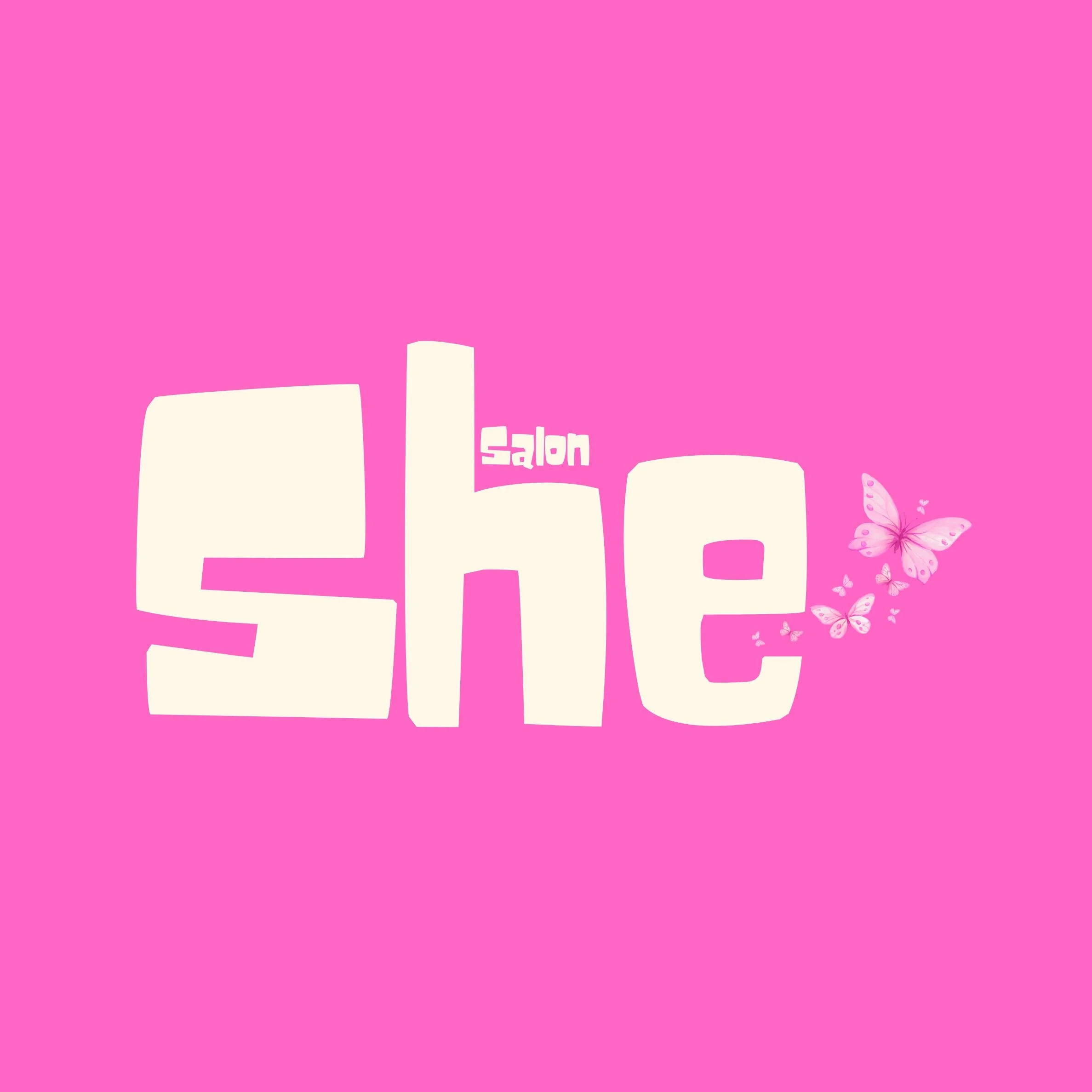
Modern beauty branding needs to be as versatile as the services it provides. For She Salon, the focus was on iconic legibility. The customized, heavy-weight typography creates a massive visual footprint, ensuring the brand is recognizable from a distance—perfect for storefront signage.
We tucked the word 'Salon' into the negative space of the 'h', showing a meticulous attention to detail and composition. The trail of butterflies adds a sense of movement and organic beauty, breaking the geometry of the letters to create a brand that feels alive, fresh, and approachable.
She Salon
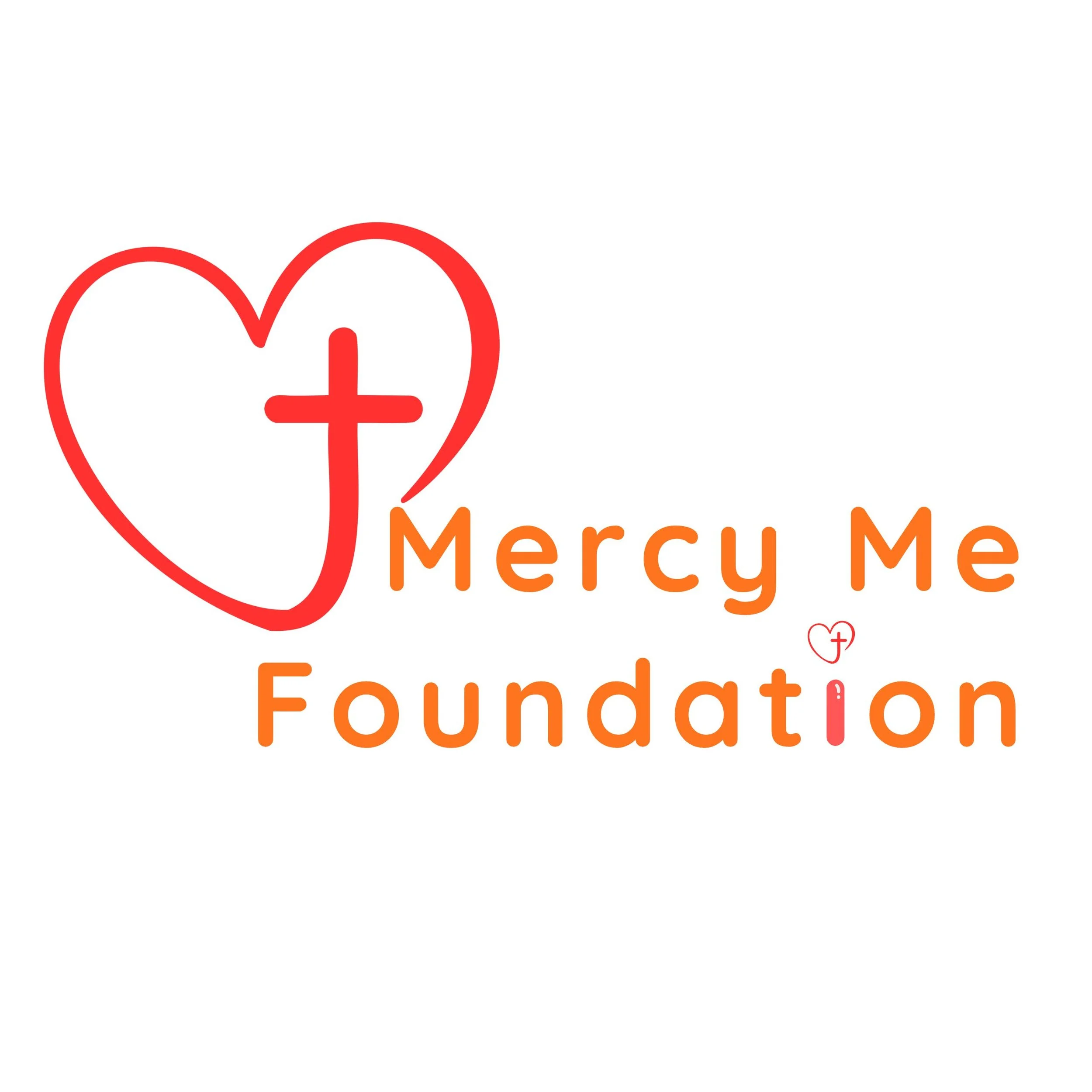
In the context of winning souls, the cross is the literal center of the heart. It suggests that the "mercy" being shown isn't just humanitarian, but specifically Christ centered.
Notice the gap at the bottom left of the heart. Symbolically, this represents a broken heart for the perishing or an open door for those being rescued. It avoids being a closed loop, suggesting an outward reaching movement.
In the word Foundation,’, the 'i' is topped with the mini-logo. This can be interpreted as the individual soul being capped with the cross and heart the literal winning of a soul through the foundation's work.
Mercy Me Foundation
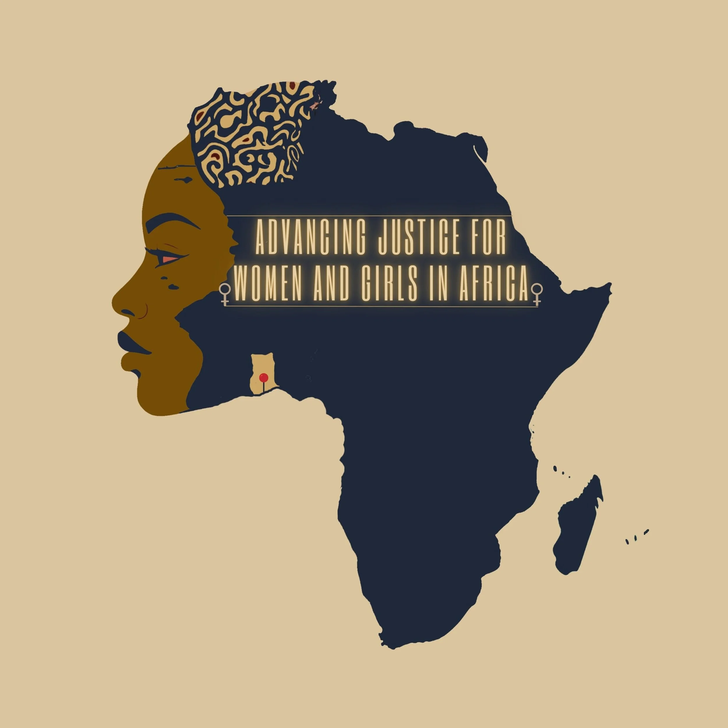
The fusion of the woman’s profile with the map of Africa signifies that the justice being administered is not an external concept being brought in, but one that is inherent to the continent itself. By placing the woman’s face within the geography, the design suggests that the protection of women and girls is at the very front of the continent’s progress. The intricate pattern at the crown of the head can be viewed as a symbolic crown of wisdom, befitting the status of the senior judges and legal minds behind the initiative.